Pew Research Center’s yearlong American News Pathways project examined how Americans’ news habits and attitudes related to what they heard, perceived and knew about the 2020 U.S. presidential election, the COVID-19 pandemic and protests against racial inequality following the killing of George Floyd.
At the project’s core is an interactive tool that lets users create custom tables so they can explore the Center’s survey questions.(Note: data in the tool were collected from November 2019-December 2020). Here’s a step-by-step guide for how to use it.
Step 1: Select a survey question. You can explore topics by typing a key phrase into the search bar or by browsing the featured survey questions on the left. Browse 500+ survey questions and filter the list by topic or by survey field dates.
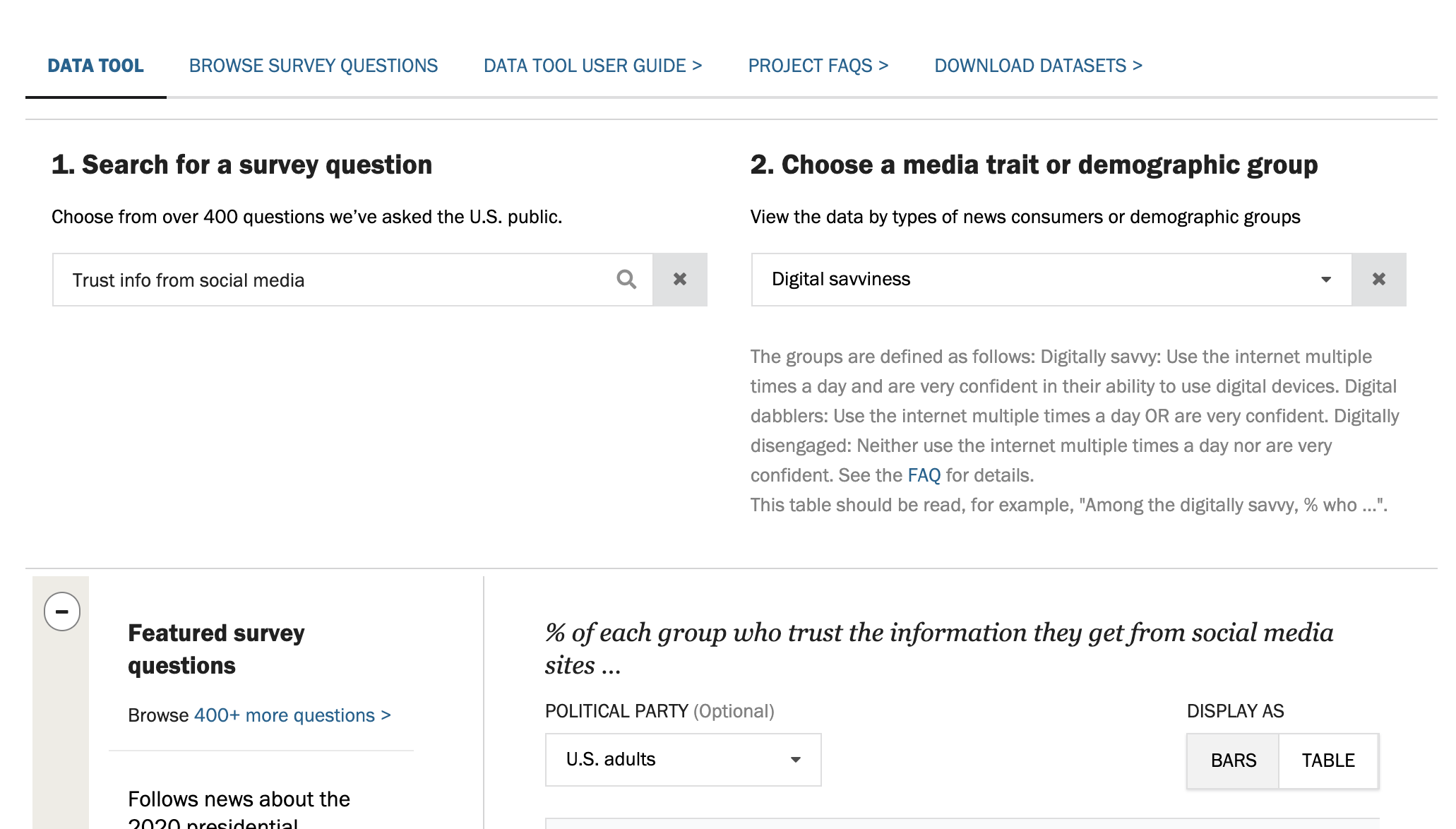 Step 2: Select a media trait or demographic group. You can explore results among all U.S. adults, by news consumption habits or attitudes, or by demographic group, such as gender or age. Note: If you select a survey question before choosing a trait, a chart will appear showing responses among all U.S. adults by default.
Once a media trait or demographic group is selected, a definition of it will appear directly under the dropdown menu in gray text. For example, choosing the variable “Digital savviness” gives the names and definitions for each of the three subgroups within that variable: “The digitally savvy,” “Digital dabblers” and “The digitally disengaged.” The text also links to FAQs with more details, as well as instructions about how to read the data.
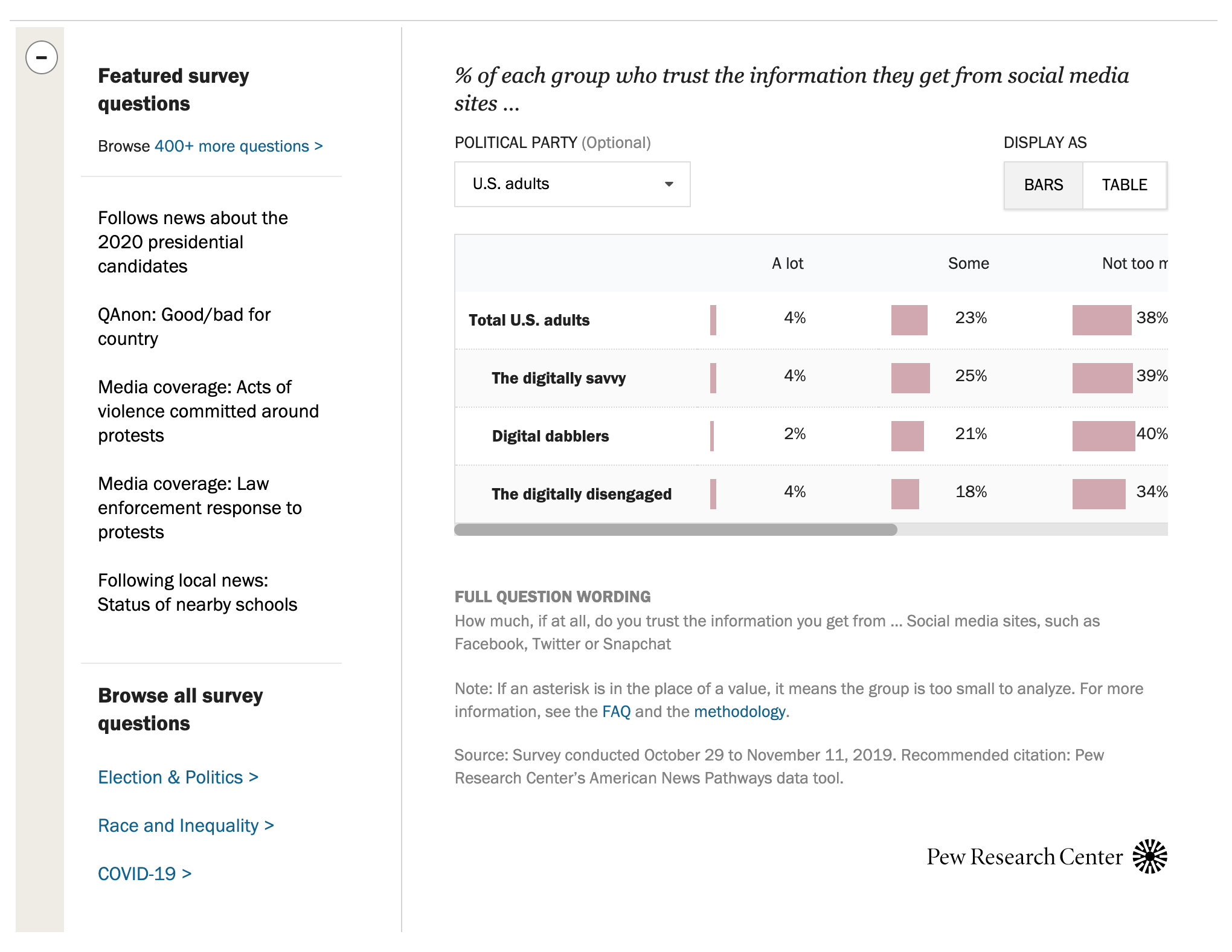 A bar chart will then appear. The full question wording, survey dates and other details about the question are displayed below the chart. For example, selecting the question “Trust info from social media” displays the response options for that question, the share of respondents who chose each option, the full question wording, survey dates and other details.
The same data can also be viewed in a table of numbers. Under “Display as” at far right, click the “Bars” and “Table” buttons to toggle between views.
Step 3 (optional): Filter the data by political party. Use the dropdown menu labeled “Show among” to show the data for all U.S. adults, Democrat/Lean Dem or Republican/Lean Rep. (“Lean Dem” and “Lean Rep” are short for those who lean toward, but do not identify as, the Democratic or Republican Party, respectively.)
For example, the screenshot shows responses only among Republicans and Republican leaners to the question about trust in information from social media by the media trait digital savviness.
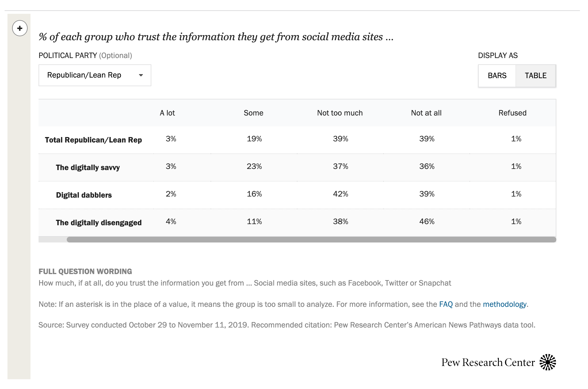 Step 4: To see the full length of some wider charts, be sure to minimize the featured survey questions. You’ll find a minus symbol in the upper left corner of the tool to widen the chart. You’ll know you’ve reached the end of the chart when scrolling, if the last column shows the share of respondents who refused to answer.
Here’s an example of what the tool can tell you: Among Republicans and Republican leaners, 39% of digital dabblers say they trust the information they get from social media sites not at all, according to a November 2019 Pew Research Center survey.
Step 6. Explore the tool. You can also:
- Browse 500+ survey questions.
- Download survey datasets.
- For publications using this data, visit here.
- See our FAQs for more details.
How to download survey datasets: To download an SPSS dataset of Election News Pathways surveys, visit our datasets page. If you have never downloaded Pew Research Center datasets, you will need to register for an account. Click on the link “Register for one” at the top to create an account. If you have previously registered, enter your email address and password. Once logged in, select the dataset you want to download and follow the on-screen instructions. See this post for more on downloading our datasets.
